NASA's Artemis program
Power & Propulsion Element
Illustration & Communications Intern
NASA's Artemis Program aims to land the first woman and first person of color on the Moon and enable future human missions to Mars. A cornerstone of Artemis is NASA’s orbiting lunar space station called Gateway and its Power and Propulsion Element (PPE). PPE provides Gateway with power, communications, and propulsion for deep space transportation, orbital transfer, and station keeping!
I have worked on a number of projects with NASA, some of which cannot be published. I won't be able to show many project visuals for the time being. However, I can provide a description of the work I've done.
As a PPE Illustration and Communication Intern at NASA Glenn Research Center (GRC), I had the chance to create corporate brand designs, various outreach materials, and a mission-critical training package for the PPE project.
Project Ideation
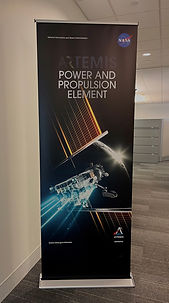
Throughout my internship, I helped lead the development and design of the official PPE project logo. The process was complex with inputs from many members of the PPE team. It was designed with many facets of the Artemis and Gateway program and heavily inspired by PPE Logo Competition submissions. This insignia will be used for all official NASA products and correspondence throughout the project life cycle.
I was tasked with designing a visual that captures key aspects of the PPE project. These include PPE's satellites and bright blue trajectory from its electric thrusters. Also, the project team wanted to highlight PPE's ability to spiral and propel itself and the Habitation and Logistics Outpost (HALO) out towards the lunar orbit.

Visual Communication
I wanted to portray the spacecraft flying through Gateway's arch, which represents PPE's project residing under the Gateway Program. Brand consistency was another factor to consider since NASA, Gateway, and Artemis are all preexisting brands related to the PPE project. Visually communicating a connection between them is vital for the viewer as they will associate PPE's logo with these brands.
Design Process
Throughout the drafting process, I modified the logo based on feedback from the PPE team members. Some notes of feedback I received included conceptualizing one cohesive trajectory, a simplified orbit, and using negative space to imply distance between Earth and the moon, which is represented at the base of Gateway's arch.
Typography Iterations

To maintain brand consistency, I decided to utilize the same typeface as Artemis. This helps build a visual connection between the brands. The break in the letter E reflects Gateway's brand and typography style. The font modification in the P was inspired by a logo competition submission. Also, the PPE typography can stand alone, meaning it can be used with or without the logo graphic and still effectively represent the project.
Color Palette
-
Bright blue to catch the eye and draw attention to PPE's trajectory.
-
Golden yellow to tie in NASA's partner, MAXAR Technologies, as this company will develop the PPE spacecraft.
-
Graphite and lunar gray to capture Gateway's arch.
-
Deep navy for Earth and its 3-dimensional shape.
While not shown in my portfolio, the logo's color palette also carries significance: